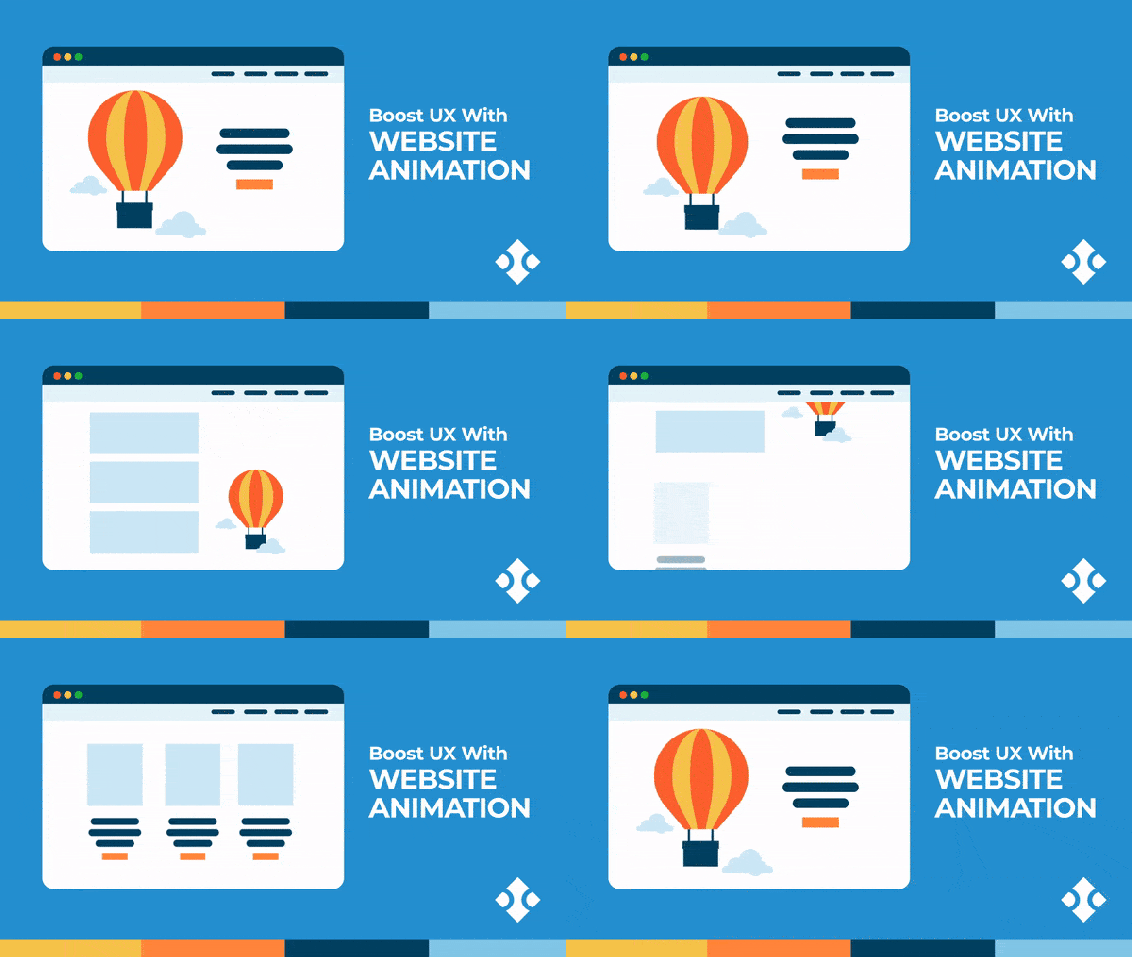
Dos and don’ts of using animation in a website
Animation in a website, When it comes to the designing of a website, plenty of professionals think that using animation is a great way to communicate various ideas across to the consumers. They can project a powerful user experience and create dynamism in a website. On the other hand, there are also people who consider animation to be rather unprofessional and distracting. However, the real truth is somewhere along the middle. While animations can greatly improve the look and feel of a website, they must be used in an effective manner to achieve the best results. It is a well-known fact that unplanned and careless use of animation can look extremely disturbing. Due to this reason, a leading web design company Sakshi Infoway walks us through the various dos and donts associated with adding animation to a website.
How animation works
Animation in a website can be used in a number of different shapes and forms. In some cases, they can only appear as a subtle form whereas in others they may have a full-fledged animated background. There are also animations that can create interactive reactions for your users to interact with a website like for instance scrolling through a page. Sometimes animation is applied to numerous small elements such as arrows. It is important to learn everything that is to know about animation so that you can use animation in an effective and strategic manner.

Effective ways of using animation
One of the things that you need to remember while using animation is that moderation is the best strategy to get optimum usability from it. While you should not refrain from using animation where it is absolutely necessary, you should not overwhelm your users by filling up the whole web page with large volumes of animation just because you think you can do so. Moreover, adding too much animation to a site will only overburden it in the long run and make it load slowly. This means that when you use animations lightly, you ensure smoothness and user-friendliness in multiple ways.

Make your animation singularly functional
The best way to use animation is to ascribe a specific purpose to them so that they are used in the best possible manner. You can use animation to break the static scroll of a website, visualize the impact of the service or product that the site is offering, telling the story of the business in a smart manner, and allowing smart end navigation through the website.
Decide on the specific elements that you need to use animation for
The effectiveness of your site’s animations is also going to depend on the elements for which you use animation. For instance, you can use animation with navigation buttons, linked images, CTAs; directional elements like arrows and background scrolling; loading bars as well as the elements that help in drawing attention like lightboxes, new messages icons, and complete order buttons. It is important to make sure that the site looks neat and crisp so that your users have a positive experience while they are using it.


