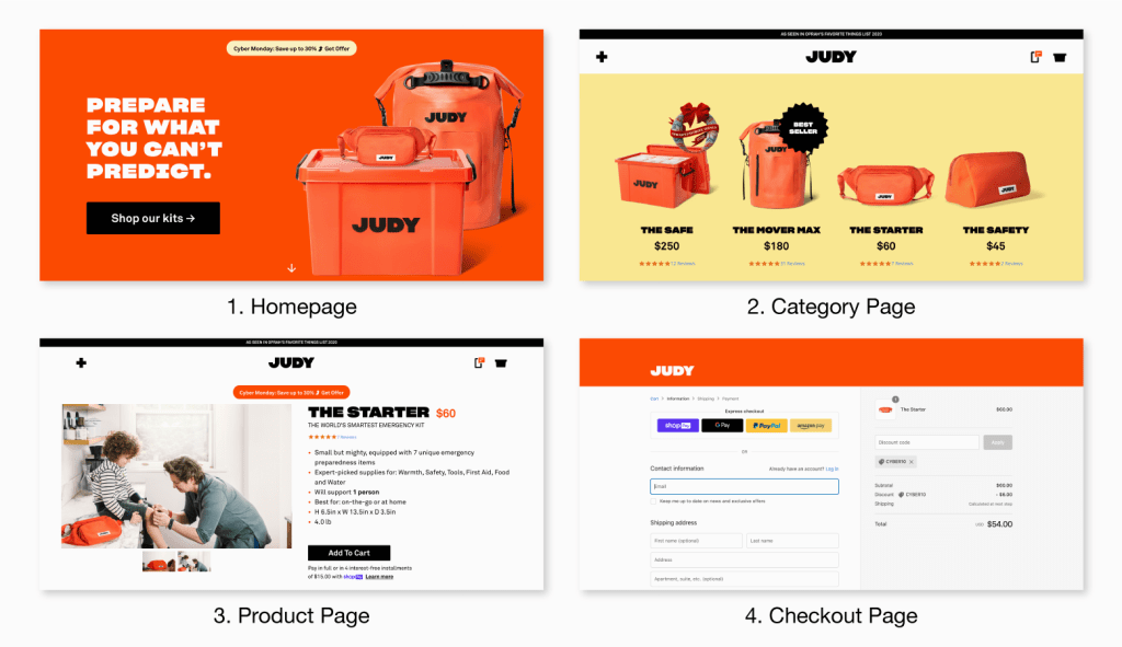
Ecommerce UI Designs Designing Better With Best Practices
E-commerce is one of the most popular online sectors, with a significant percentage on both social and eCommerce websites. With so many sites using E-commerce design and trends, there are also many designers who have started exploring how to create more detailed and appealing designs. In this blog article, we’ll discuss some useful tips for creating better e-commerce UI designs.
What are Some Key UI Designing Trends?
The state of UI Designing has evolved over the past decades, it has become much more complex and design-centric. The current trend is to look towards digital products, apps, websites and other digital platforms that have happened to rule the online world. With the new UI designs in mind, the industry is looking towards better practices in order to create effective products and increase user experience.
User Experience Prototyping Basics
User experience prototyping is a technique that allows you to test your design ideas with the help of real people. Using wireframes, mockups, and prototypes to interact with users will reduce the risk of building something that does not meet user expectations. Lean UX is an iterative design process for contemporary digital products. It helps companies make better decisions by asking questions about their product after every step in the design process.
Design Principles
There are a number of design principles to consider when you’re designing an e-commerce UI. Designers should be aware of the following principles in order to achieve the best possible user experience. Design principles are the key to creating a standout product. The principles outlined in this blog, including trust and user-centred design, can be applied to any type of ecommerce site or app.

Web Search Engine Optimization
Web Search Engine Optimization is important to the success of any website. It is crucial that you keep your website on top of the search engine result page or SERP. For this, it is necessary to optimize content, title and meta description in order to draw more visitors and better sales. Search Engine Optimization (SEO) is a process that helps website owners improve their ranking on search engines. It includes many tactics like backlinking, linking to your site from Google+, social media sharing, and other tactics. If your website doesn’t rank well on Google, you won’t be able to gain customers and make any sales. In order to get people to visit the website, you need to optimize it for high-ranking keywords so that people will find them quickly.
Feature Planning
Part of the design process is feature planning. Using this process, a designer can determine what features they want to include, how many they’ll need, and how they’ll be used. This way, the designer can focus on delivering a good user experience across all aspects of their website. As explained in HCI’s article on design best practices, “A good example of this is the idea that there must always be a better alternative to any given decision.”
Colors and Fonts
There are many trends when it comes to ecommerce UI design. One of the most popular styles is a gray background with black text on top of it. Another trend is the use of white sheets and grayscale images. Colors can create a mood in an area, so try using different colors in your layout to see what works best for you. Fonts are another important element to consider when designing a website. The font should be clear without being too small or too big. Also, avoid fonts that look too modern or old because they can make the site feel outdated.
Visual Hierarchy
Create a visual hierarchy of your design by organizing the hierarchy of your UI. The best practices include: Horizontal card stack, Weighted font, Tablet-friendly and responsive design. To create an appealing user interface, it’s important to introduce visual hierarchy. Visual hierarchy is a series of principles that help to achieve greater clarity in design. It lets the user know what’s most important on the screen and where they should focus their attention when navigating a website or app.
Designing for Interactivity
One of the most crucial factors when it comes to ecommerce design is the level of interactivity. The more engaging the design is, the better it will perform in terms of conversions. To create an interactive experience, brands should use best practices such as proximity, animation and color to engage visitors in a fun way.
Form Design
A key factor in the user experience of an ecommerce site is the design of its form. The best practices for form design include but are not limited to: keeping fields short, including field validation, showing error messages in a clear and concise manner, and making forms easy to use. If you are designing a form, the fundamental goal is to make it easier for the user to complete. There is no need for an overly complicated design if you can make it simpler with familiarity. Use a variety of colors and fonts to create contrast. A smaller space or less text might be easier on the eyes.
Navigation and Content Lists
The first design patterns for e-commerce UIs are the navigation and content lists which help the customer feel like they’re getting to know the site. The guides provide design patterns for these types of UI elements that will give maximum results in terms of sales, conversions, and user experience.
Conclusion
The conclusion of the article provides some useful tips for designing an ecommerce UI. It also provides links to some resources for those who are interested in learning more about design and the steps that have to be taken before designing a website.


